Fortini’s logo is a unique graphic expression that represents Fortini brand. It is the most significant and unifying feature of the brand identity and is to be used on all types of brand communication.
In order to preserve high legibility of Fortini logo at all times, the preferred background to be used is 100% white.
In case applied to colored or textured backgrounds, as well as pictures, please make sure you consult Global Growth Category Team.
The logo must be surrounded by a minimum amount of blank space at all times.
To maintain its visual integrity, it should never be placed too close to other visual elements, such as text, titles, symbols, etc.
The minimum blank space surrounding the logo type and brand signature is represented by “I dot”.
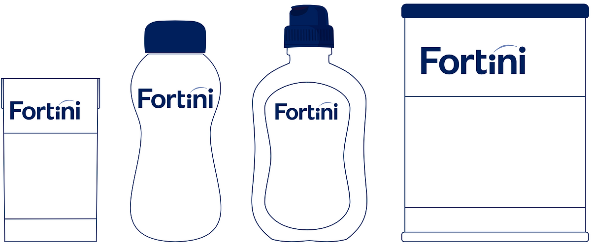
Fortini’s logo should always be on the top of the packaging to provide prominence.
Fortini’s logo has various forms, one for each range of the brand.
The differentiation is made based on the color of the arch, which is the same color as the range name.
These are the incorrect uses of the logo.
Never move, delete, rearrange, or rotate any elements of the logo from their respective positions.