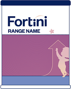
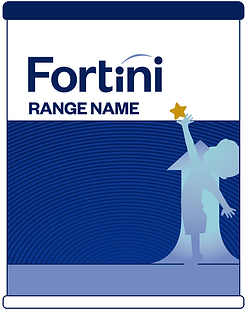
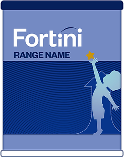
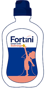
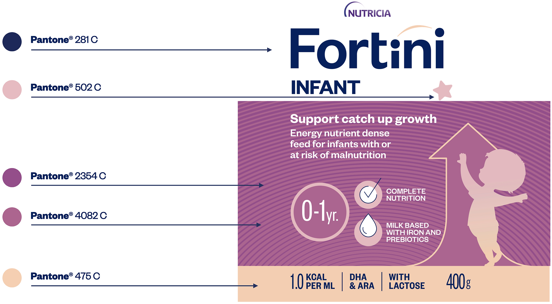
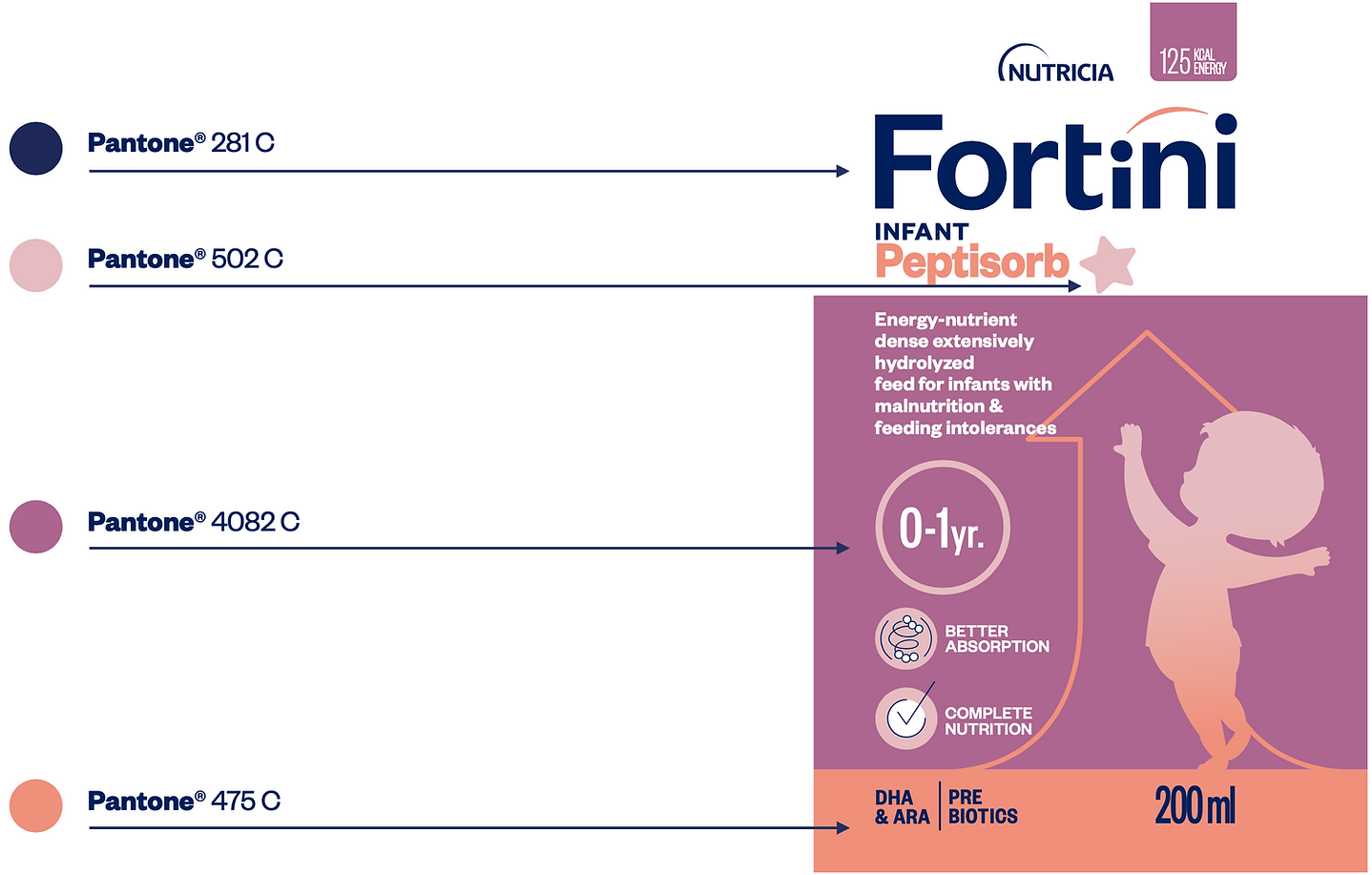
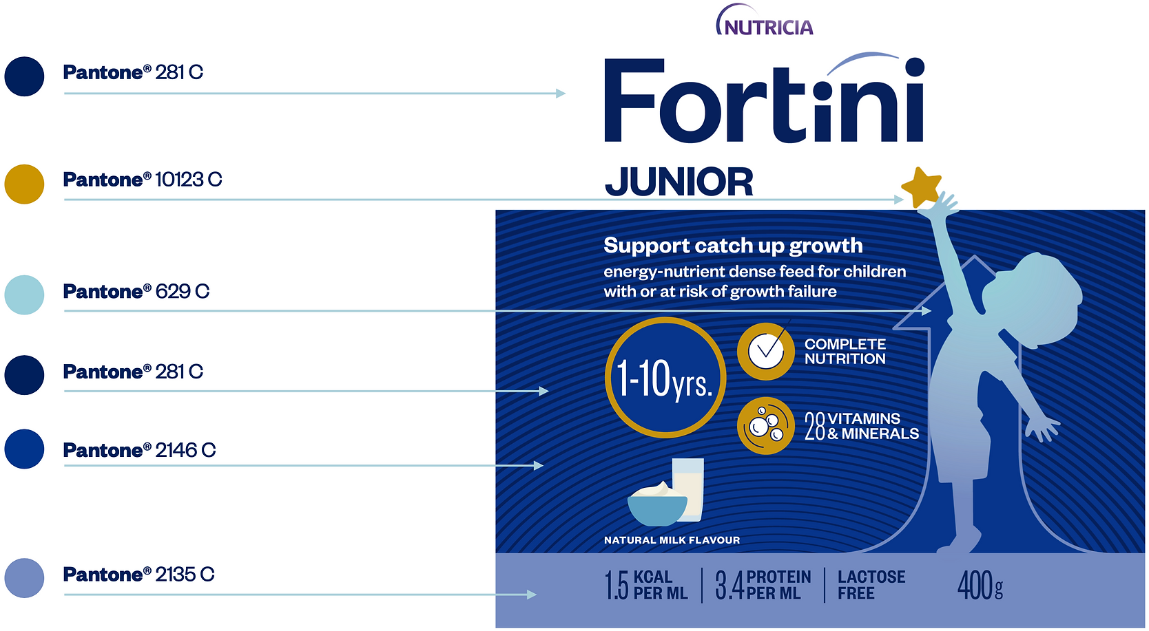
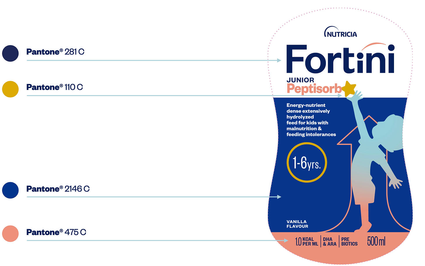
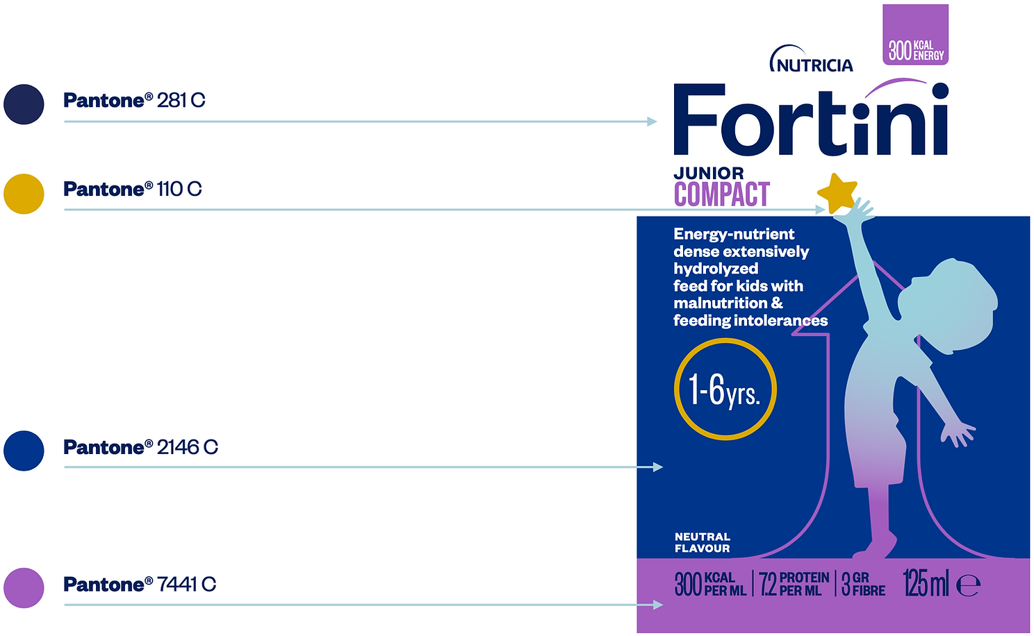
Colors make key elements of Fortini’s DNA: scientific character of our products, merged with caring approach to our target audience.
The specific color tones were developed to emphasize premiumness of our products.
Main Palette
LOGO
The logo is the graphic expression of the brand that must always be used in Pantone 281 C, so that it is immediately recognizable in different contexts.
PRIMARY COLORS
Primary colors are used to distinguish brand ranges: Infant, Junior and Complete.
PANTONE – 281 C
CMYK – 100/90/31/35
RGB – 6/37/91
HEX – #06255B
PANTONE – 4082
CMYK – 35/71/20/0
RGB – 153/101/141
HEX – #99658D
PANTONE – 2146
CMYK – 100/86/18/7
RGB – 0/52/141
HEX – #00348d
PANTONE – 2607 C
CMYK – 81/100/0/33
RGB – 71/19/115
HEX – #4A1373
Secondary Palette
Secondary colors are used to distinguish Sub-ranges within a range (Peptisorb and Compact).
PANTONE – 486 C
CMYK – 3/53/47/0
RGB – 215/142/123
HEX – #d78e7b
PANTONE – 1565 C
CMYK – 0/45/60/0
RGB – 239/160/107
HEX – #efa06b
PANTONE – 7441 C
CMYK – 45/73/0/0
RGB – 144/92/187
HEX – #905dbb
Supporting Palette
Supporting colors are used to depict benefit icons or to communicate flavor variations in some exceptional cases.