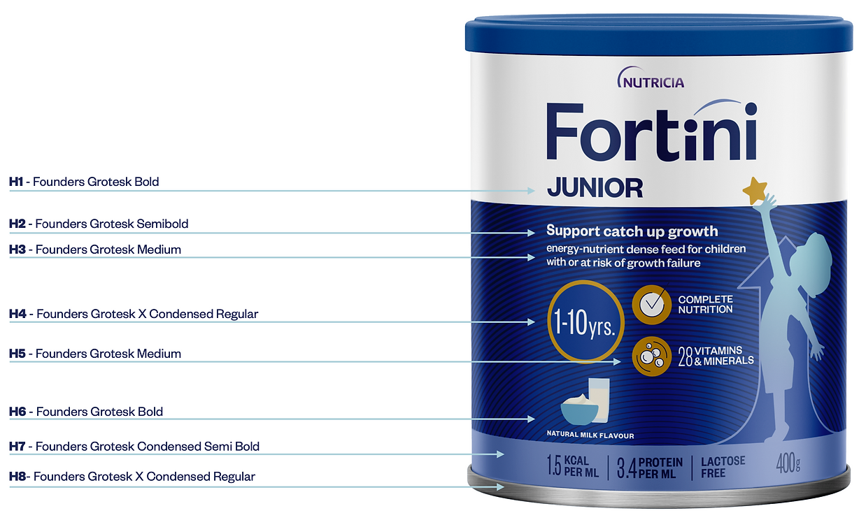
Our typography family is Founders Grotesk: a grotesque sans-serif typeface designed by Kris Sowersby of the New Zealand-based Klim Type Foundry.
The design was influenced by classic grotesques from the early twentieth century. It resolves the best details from the last century into a large family designed for modern typography.
We chose this typography for its wide range of variants and for the modernity of its forms.
It comfortably meets all of Fortini’s communication needs, whether in packaging, digital or printed materials for various purposes.