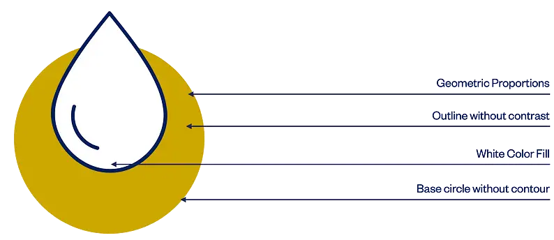
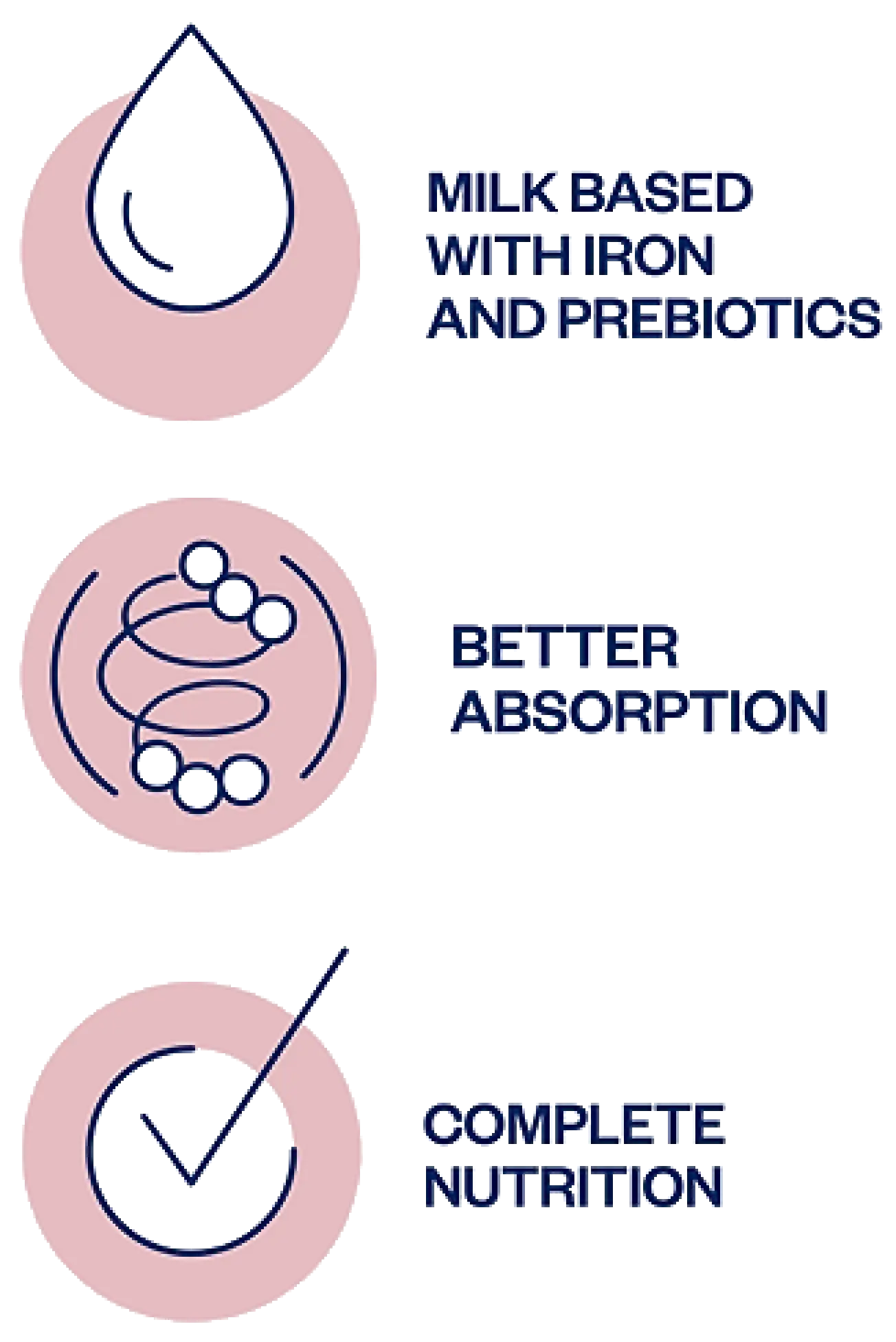
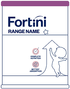
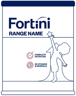
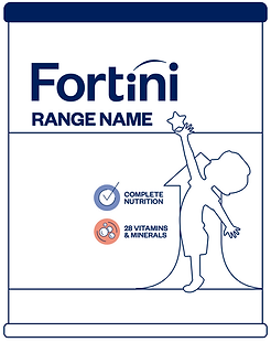
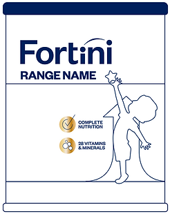
All icons displayed on our packaging or other communication materials represent our products benefits. They are created exclusively for Fortini so the rules apply when designing and applying them.
Pantone – 502 C
CMYK – 9/29/14/0
RGB – 217/185/191
HEX – #D9B9BF
Pantone – 110 C
CMYK – 16/31/100/0
RGB – 205/168/0
HEX – #CDA800
These are the incorrect uses of brand iconography.
The icons descriptive text is always positioned left from the growth graphic element
The icon background color should never be mixed among brand age ranges
Different color combination should not be used
Icons cannot be redesigned or exchanged for others that are not part of the brand asset library
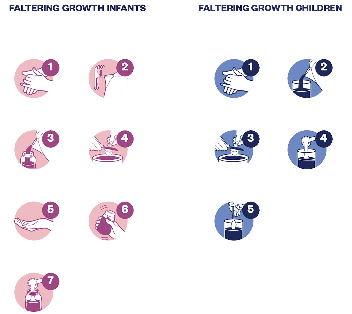
The infographic illustrations complement the preparation instructions. They are simple and explanatory, positioned on the back of the packaging.
Each range has its specific preparation process, followed by a specific color palette.